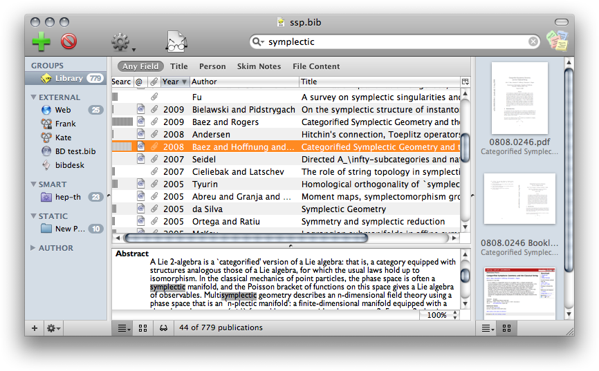
BibDesk is a very functional and performant bibliography manager for OS X. It is free and open source and has been my tool of choice for many years. Its main window is organised along a classic Mail-esque layout: list of sources on the left, list of records on the right, bottom pane showing the detail of the currently selected record(s). The information displayed in the bottom pane is left to the complete discretion of the user thanks to a very powerful template system.
The default template is straightforward: a list of fields and their values. I wanted something more compact so that I could see most of the information related to at least one record on my 13″ MacBook screen. Some fields can easily be combined on one line (volume, number, pages, etc.). The most voluminous fields left would then be the abstract and my personal notes. Furthermore, those fields have long sentences and reading them spread across the whole screen was . A natural solution was therefore to design a template with two columns, which both saves space and makes for shorter lines.
I started this template with the template editor built into BibDesk and then heavily modified it. I changed fonts and colours, added two-columns tables, used several field modifiers (to parenthesize issue number in volumes or add commas where needed), and added links and icons. The RTFD version was edited with TextEdit while the HTML/CSS version was hand-coded in TextMate. The icons where drawn in Inkscape. The end result looks something like this:
The style is mostly muted and neutral, to fit with the rest of the UI. I chose Lucida Sans, in point sizes between 10 and 14, and mostly in shades of grey. I used the different shades of grey to highlight the bits of information I read the most and which are not clearly displayed in the publication list above (namely the abstract and personal notes). Various personal categorisation fields (keywords, taxonomy, and location) were further highlighted in red and presented with custom icons. The links cannot be styled (unfortunately) and appear in the usual underscored blue
This style adds some (hopeful useful) functionality:
- it displays the highlights and notes made the PDF in Skim
- the DOI is a link resolved through http://dx.doi.org, which hence points to the page of the paper on the publisher’s website.
- the magnifying glass icon on the left of the title is a link which searches for the title and first author of the current paper. It allows to quickly find out more information on the paper, such as the number of times it was cited, or to regularly check whether Google’s robots have found a PDF for that dreaded paper you cannot find anywhere.
If you like this style and want to use it, you need to download
then place the (extracted) files in ~/Library/Application Support/BibDesk/Templates (where ~ is your home directory), create a new template entry in the preferences, following these examples for the RTFD template and for the HTML template, and finally select the newly created template in the templates menu at the bottom of the main BibDesk window.
NB: those templates take advantage of recent modifications of BibDesk by Christiaan (who’s been amazingly reactive). You need a created on or after 2010-09-28 for all features to work.
Caveats
All improvements are of course welcome. The “code” is available on Github under the name bd-two_columns. Current issues include:
- I was looking for a way to display the thumbnails of the linked files elegantly in a template, with functionality similar to the sidebar on the right (preview, clickable links, etc.). I only partially succeeded and eventually decided to remove this feature.
-
Similarly, it would be nice to have the DOI be a link resolved through doi.org so that it points to the publication online✔ Done - Only a few BibTeX type are handled by this template (article, book, incollection, manual, techreport, misc, phdthesis, unpublished; i.e., the ones I use). All others use the same style, with key-value pairs similar to the default BibDesk style.
-
The left column (and in particular the abstract) is not easily selectable. You need to start selecting from the title and therefore select un-necessary text.✔ Done -
The HTML version features a link to a search for the article that I don’t know how to re-create in RTF✔ Done - The Google Scholar search icon is placed at a fixed location in the HTML template (which makes it easy to click) but I cannot emulate the same in RTFD
- The width of the tables in HTML is limited to ~800 px
Thanks alot for sharing this! It makes a great enhancement to BibDesk in my opinion!
I also like to use the Cites and Cited-By fields to create cross-references between articles, especially using Cited-By to remember how I found the article. So I added the following to the HTML template to show them in the template as clickable links, just below the cite key. It may be interesting for others who use these fields in the same way, but I think the Cites field is also used to keep track of the number of citations by some people. I’m not sure if one way or another to use the field is standardized or more common…
Cites:
Ok, most of the code got clipped away, but I emailed it to the author as well.